
Aurich Lawson / Thinkstock
With Christmas now long behind us, one or two of you may well have been lucky enough to find a shiny new Windows 8 PC under the tree. After cleaning off the crapware,?it's time to use the thing, and that means digging into the new user interface.
The Windows 8 user interface has many Windows users divided. The chief complaints are that Windows 8 has no Start button and that it has no Start menu, only the (full-screen, Metro-styled) Start screen. Secondary to these is the complaint that Windows 8 shows the Start screen immediately after logging in, rather than showing the desktop as prior versions of Windows have done. Getting to the desktop takes an extra click.
To address the unfamiliarity and (perceived) problems with the Windows 8 UI, a number of third-party applications have popped up?to provide a Start menu, or some approximation thereof, and a Start button for Windows 8 users. They also pull some kind of trickery to switch directly to the desktop upon logging in.
Some of these applications are new, motivated entirely by Windows 8's supposed "shortcomings"?Stardock's Start8, StartIsBack, and RetroUI all share this characteristic. Others are new versions of old apps. Classic Shell was originally a project to reinstate the Windows XP Start menu on Windows Vista and Windows 7 (among other things); it now has some Windows 8-specific functionality. Pokki is an application runtime, launcher, and marketplace; in its latest iteration it too jumps on the Start screen replacement bandwagon.
If you can't stomach the lack of menu and button in Windows 8 or just don't fancy the support and training overheads that come from rolling out a new user interface to users familiar with Windows 7 or older, one of these apps might be the ideal solution.
StartIsBack
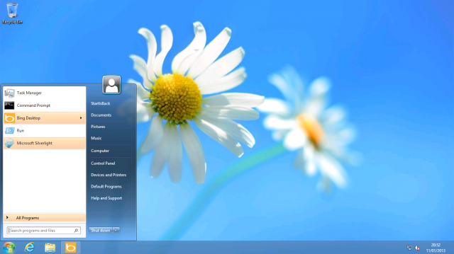
When it comes to providing an authentic Start-like experience, the clear winner is StartIsBack. The StartIsBack Start button and menu look all but identical to their Windows 7 versions. The developer claims?that although the Start menu isn't accessible in Windows 8, Microsoft had to leave most of the implementation and plumbing in the operating system for backwards compatibility reasons. StartIsBack taps into these hidden capabilities to provide a Start menu experience that will be immediately familiar to anyone who has used prior versions of Windows. It has the right look (down to the glowing hover effect when the mouse cursor is over the Start button) and offers the same features, including integrated search and highlighting of newly installed applications.
The range of options and settings for StartIsBack is similarly authentic, although the layout of those options is not.
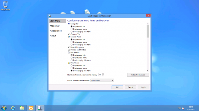
On top of this genuine Start menu experience, StartIsBack provides some control over Windows 8 features. Logging in direct to the desktop is the most important for those wanting to turn Windows 8 into Windows 7, and StartIsBack duly provides that option. Beyond that, StartIsBack allows you to disable the hot corners. With StartIsBack you can still have access to the Start screen if you want; you can also elect to remove all desktop apps from the Start screen, making it a launcher solely for Metro-style apps.
Metro does still poke through occasionally. The Win+Tab combination still invokes the new Metro app switcher rather than Flip3D. Similarly, Win+F takes you to the new Metro search screen rather than an Explorer search window. StartIsBack also doesn't do anything to reinstate desktop functionality for things that have been moved into the Metro universe; clicking your network connection still shows a Metro-esque panel, adding a Bluetooth device still takes you to the Metro Settings app, and so on. Nonetheless, this is the best Windows 7 workalike if that's what you're after.
Metro poking through here and there is a common feature of all these applications. If you simply can't abide by seeing any aspects of the Metro interface on your desktop PC, none of these applications will make Windows 8 good enough for your preferences.
Licenses for StartIsBack start from $3 per PC, with a free 30-day trial. The app can be installed and used as a regular unprivileged user. When running, it doesn't even create any extra processes; it just loads an extra DLL into the Explorer process that Windows always runs anyway.
Start8
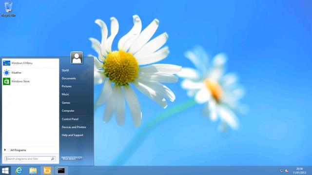
Another near-exact clone of the Start menu is found with Stardock's Start8. I haven't poked around too deeply in the internals of this app, but from the look and feel of it, it's using the same technique as StartIsBack. Namely, it takes Windows' own remnants of legacy Start menu code to provide an authentic-looking, fully functional Start menu. There are some minor differences: Start8 includes a special Start menu entry that opens the Start screen, and it has a small glitch in its shutdown menu, but aside from that, there's nothing to choose between them.
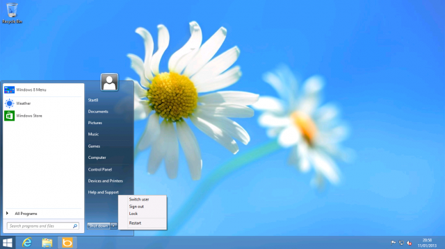
Like StartIsBack, Start8 also includes selective disabling of hot corners, booting straight to the desktop, and other similar options. It does, however, have one trick up its sleeve that StartIsBack lacks. Instead of showing a regular Start menu, you can tell Start8 to instead show a Windows8-style menu. To do this, StartDock has simply placed the Start screen inside a borderless window on the desktop. The Start screen retains all its functionality, such as the options in the settings charm and the app bar that appears when you right click. It just occupies a fraction of the screen rather than the whole thing.
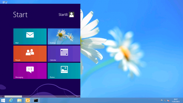
The appeal of this isn't really clear to me. I could see how some derivative of this idea might work nicely enough, if you tightened up the spacing and scrolled vertically rather than horizontally (in other words, if you adapted the Start screen to fit into a roughly Start menu-sized area), but as things stand it's the worst of all worlds.
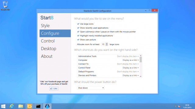
Start8 pricing starts at $4.99 per PC. I can't really see the appeal. If a Windows 7 Start menu is what you want, StartIsBack offers the same for less money. Start8's additional Start-screen-in-a-box menu doesn't add much value as things currently stand.
Start8 is also a whole lot less convenient. It requires Administrator rights to install and creates a system service. There appears to be no good way of restricting it to certain users, and if you want to use it on someone else's machine (for example, if you want a Start menu on a Windows 8-equipped corporate desktop) then you're out of luck.
Classic Shell
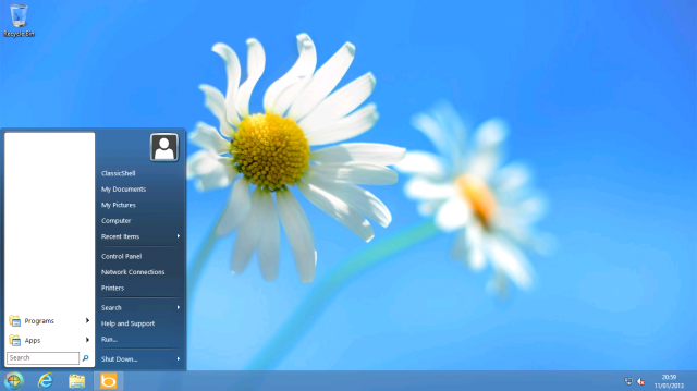
If the Windows 7 Start menu isn't to your taste, you might want to check out Classic Shell. Classic Shell strives to provide something altogether more old-school. Although it does have a Windows Vista/Windows 7-style menu, its raison d'?tre is harking back to yesteryear, with both a single column (Windows 2000-style) and dual column non-searchable (Windows XP-style) menu on offer. Unlike StartIsBack, which leverages Windows' own code to draw its menus, Classic Shell undertakes to perform all the drawing and layout itself. As a result, none of its menu options look quite right. They're immediately recognizable as knock-offs.
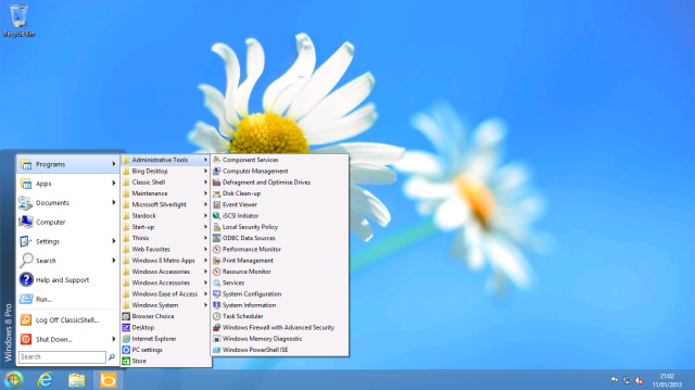
I found this unfulfilled aspiration annoying to use. Nothing works the way it should, nothing looks the way it should. Personally, I would rather have an app that implemented its own concepts well, rather than poorly imitating someone else's concepts.
Classic Shell is also strongly influenced by the?idiosyncrasies?of its developer. Even when using a Windows Vista/Windows 7-style menu, the Programs folder is a conventional fly-out menu (as it was in Windows XP and below) rather than the weird in-line contraption that the newer operating systems use. It also has a second fly-out menu for Metro apps. If one prefers the fly-out menus, this is fine; if one wants the menu to simply behave like it did in Windows 7, it isn't. Similarly, although the Classic Shell menu has a search box, it doesn't work like its corresponding Windows 7 feature; it can only search the menu and system path. The Windows 7 search feature can be configured to search the entire machine, using the operating system's built-in content indexing.
Classic Shell has a couple of Windows 8-specific features; it can boot straight to the desktop and disable hot corners. It offers less fine-tuning here than StartIsBack. That program allows hot corners to be disabled individually; Classic Shell allows you to disable all of them, or just the bottom left (the hot corner that normally brings up the Start screen).
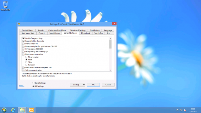
In addition to the Start menu workalike, Classic Shell also (optionally) adds toolbars to Internet Explorer and Explorer to reinstate or provide easier access to certain features. For example, the Explorer add-ons will replace the "conflict" dialog boxes when copying files with identical names with older versions and add a toolbar with cut, copy, and paste buttons. The Internet Explorer add-ons didn't appear to do anything in Internet Explorer 10 (perhaps unsurprising, as they're intended for Internet Explorer 9). The Explorer additions similarly seemed superfluous (at best) or unwanted (at worst). They're also ugly, as they fail to match the prevailing styling of the operating system.
Classic Shell's installation system is annoying. Technically, it works just fine when run as a regular app; it doesn't need Administrator rights or anything like that. However, just as with Start8, the installer requires Administrator rights and installs a system service. Allegedly this service is required to ensure that Classic Shell starts up quickly and can properly enable booting directly to the desktop (rather than to the Start screen). However, StartIsBack thoroughly debunks the notion that you need a service to do this, given that it boots straight to desktop with no service necessary.
Classic Shell is zero cost and open source. If you want an actual Windows 7 Start menu, skip Classic Shell. StartIsBack and Start8 both do the job much better. If you really hark back for the Windows XP Start menu, then Classic Shell is probably your best bet, but I'd have to wonder why anyone would want to give up search directly from the Start menu.
prop 8 maria menounos proposition 8 ricky martin larry bird chauncey billups caucus results
No comments:
Post a Comment
Note: Only a member of this blog may post a comment.